

The artist life is not for the faint of heart. No research required for that one. With a murky path to steady income, the continual hustle required to get your work seen, improve your skills and refine your vision, success is an elusive target.
With this knowledge as a starting point I set out to design a product that could help artists navigate the inherent challenges of their chosen profession.
My Role
UX researcher, UX designer, UI designer, interview scheduler, fake content creator... soup to nuts, I did it all!
The Challenge
Unearth the obstacles and pain points of local artists and design a product that addresses their needs with empathy and efficiency.
The Approach
Placing the focus on the user
Drawing on early career experiences as a fine art student considering what the future held, I came up with an initial problem statement: Artists need a way to connect with their local community because art is an extremely challenging field and peer support will make it easier to navigate.
The Discovery
Developing a research plan—let’s design the right thing, shall we?
Armed with an admittedly broad initial problem statement I put together a research plan, including competitive analysis and discussion guide. High level, I wanted to see what other products were out there and how they were addressing the challenges of being an artist, and ground level, I wanted to talk to artists and learn about their current habits as well as the challenges they faced.
Competitive analysis
I chose 4 digital platforms available to artists: Are.na, Daise, Behance, and Tattoodo. Using a plus/delta model and feature inventory to organize my findings, I found that each platform offered something of value: Are.na allows for seamless collaboration with others, Daise offers a supportive community geared toward younger artists, Behance makes it easy to browse then save inspiration for later, and Tattoodo provides a convenient portfolio viewing interface. But there was a gap in the offerings. None of them created a holistic art-ecosystem where all those features—ease of collaboration, a supportive community, finding inspiration, displaying your work—existed along side a steady feed of what was happening on the local scene.
Click here to view the plus/delta model and feature inventory.
Discussion guide- so much to learn... where do I start?
With a topic map of course! I took a hypothetical stab at features that could be of use—tools for easy collaboration, sharing work, finding inspiration, and connecting with other artists—and then built interview questions around those topics. By the end of the exercise I was ready to find some actual users to talk to.
Click here to view the complete research plan.
User recruitment- it’s anyone’s guess until I talk to someone...
I created a quick ad and posted to creative gigs on Craigslist. The responses ranged wildly and I did my best to authenticate them, however after a reply that began “I have a very interesting and also developing story. Heres a hint to how interesting it is. I am currently housed in a mental hospital...” I knew that broadening my recruitment methods would benefit the project. I connected to the City of Boston Arts Twitter feed and they generously agreed to post my ad. Soon after I had my user interviewees.
The interviews
Over the course of 2 weeks I conducted 5 recorded interviews that varied in length from 45 to 120 minutes. Luckily, the local artists I spoke with were forthcoming and also enthusiastic about the potential existence of something like ArtistConnect.

Data synthesized! If you’d like a closer look, view affinity map photos and digital representations here.
Synthesizing the data
As I reviewed interview recordings, the challenges, motivations, habits, goals and needs of local artists started to become more clear. Using an affinity map allowed me to pinpoint some noticeable trends:
All artists I spoke with were social media savvy and active on digital platforms
A lot of energy is spent trying to connect with the local art community
Making money through art can be a difficult and frustrating endeavor
The act of promoting oneself is exhausting and not something most artists enjoy
Finding other artists to collaborate with is difficult and awkward, but not everyone is looking for collaborators
Workshopping ideas and getting informed opinions on work was of interest
The ability to easily share work and connect with other artists would be very useful
I then took these trends and bucketed them into 2 distinct categories: Making a living and connecting to other artists. These categories were the dual north stars that provided guidance throughout the rest of the design process. All future design decisions would have to somehow relate to one of the 2 buckets.
Persona creation
I built out 2 personas: Frankie, an up and coming artist with a drive to learn, and Jo, who is more established in her career, yet frustrated with the roadblocks keeping her from making the art she wants. I made sure each persona possessed some of the challenges uncovered in user research and that collectively their motivations, goals, pain points, and habits lined up with trends discovered during interviews.

Personas were a grounding presence throughout the project, a continual reminder that all design decisions led back to their needs. Click on images or here to view in detail.
Revising the problem statement
With freshly minted personas as guides I refined the problem statements to more specifically address the needs of users:
Frankie needs a way to connect to the local artist community because his current network does not have many creative professionals in it
Frankie needs a way to improve his artistic skills because he wants to grow as an artist
Jo needs a way to promote herself as an artist without it feeling so forced and emotionally draining
The Vision
The vision for ArtistConnect was beginning to take fuller form—a product that provides an environment where artists can sell and promote their work, while also connecting and supporting each other. An ecosystem rich with artist conversations where work, inspiration, and advice all exist happily together.
This vision felt right, but it also felt like something of a pie in the sky digital utopia. I needed something more grounded in reality to help get to the next step in the process. So, I went back to some guiding principles for help: empathy and efficiency. What mechanism of interaction could be easily accessible and intuitive while also being a powerful, versatile way to address user needs? I thought about how users would use the app. They would browse their feeds for sure, and there should be a robust search feature so they could find topics of interest easily... but scrolling and searching were somewhat passive activities. How could users best actively engage with ArtistConnect? How could they get the most out of the product with the least amount of effort? Was there a central flow that could serve as the backbone of interaction and also address the 2 bucketed categories of user challenges?
After running through a few ideas, the concept of post categorization came to me. If users could easily label their posts so that others interested in the post topic could easily find it, that would provide opportunity to connect cleanly around shared areas of interest while also helping organize the search functionality. To further understand how this could work, I sketched out and then refined a user flow to illustrate the posting interaction.

Initial sketch and digital refinement of user flow detailing category selection and posting. Click image or here to view larger.
The Framework
Designing for the MVP
Now that the vision was taking shape I needed a map of how to get there. What would be the basic structure (information architecture) underlying ArtistConnect?
To start answering that question I brainstormed a wide range of solutions that addressed user challenges uncovered in discovery, and sketched out a sitemap to see how it could all fit together in an app.

Initial sitemap sketch. Click image or here to view larger
I then conducted a card sort to test the level of interest in potential features.
Card sort summary:
5 users were tested
29 potential features were presented
Users were asked to rank relevance of each as “Very important”, “Somewhat important”, or “Not important at all”
After card sort, numerical values were assigned to each category: Very important = 3, Somewhat important = 2, Not important at all = 1
Highest possible score per feature was 15. “Very important” features ended up having scores of 13 or 14, “Somewhat important” features had scores of 11 or 12, and
“Not important at all” features had scores between 7-10.
View card sort here.
Results/recommendations:
The card sort was a simple test that yielded powerful results. And after it was over the navigation quickly took shape.
On the first draft of the sitemap, the top level nav did not include a Creative gigs section, a Direct connect option, a Selling art section, or a Local art news feed category. These potential features had some of the highest desirability scores so were moved up in the design hierarchy
Original top level navigation included options for organizing/attending meetups with other artists. This feature drew one of the lower desirability scores of the sort and was removed
With these results in hand, I created a new sitemap:
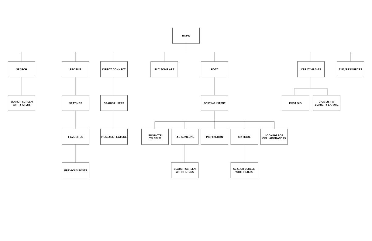
Post card sort sitemap. Click on image or here to view in detail.
The MVP(ish) prototype
Eager to get a prototype in front of users, my initial goal was to build out and test small portions of app functionality and flows so as to get feedback and iterate as quickly as possible. Having already identified the posting flow as central to users’ positive experience with ArtistConnect, I began building out a mid-fidelity, clickable version of the posting flow. However, I soon realized that slicing up flows and testing them as individual prototypes would be too time consuming and also not represent an authentic experience with the app. I wanted to test detailed task scenarios of course, but also wanted users to spend time in the ecosystem, bouncing around as they pleased without much restriction. Beyond testing general heuristics, ease of finding what they wanted and keeping the cognitive load low, what did it feel like to interact with a product designed specifically with their needs in mind?
A robust prototype is born!
With 91 screens, scrollable feeds, and something close to full functionality. You can click on the screenshot below or here to view the full mid-fi prototype.

A mid-fi, clickable prototype. Click on the image to test it out (its functional I swear :)
User testing
Prototype in hand, it was time to test it out. I developed 13 task scenarios bucketed into 2 categories: connecting or making a living. Each scenario was designed to directly test a persona goal, a mid-top desired feature from the card sort, or a fundamental usability heuristic.
4 users were tested over Zoom sessions. The sessions were recorded, analyzed and then the data synthesized through affinity mapping. Click here to view full affinity map.
User test findings and analysis, in summary:
User testing focused on whether features were intuitive, understandable and seen as valuable
Areas of focus: Making a living and connecting
High task success rates and positive feedback revealed the app was received well and with
excitement. Helpful feedback was relatively minor and will be applied to next iterationPain points discovered during research appear to be addressed to user satisfaction
App is easy to navigate with intuitive IA/UI
Some details and depth of features (mostly around posting category selection) were easily missed while the user familiarized themselves with the app
Awareness of the app’s nuances are not necessary for activity. Depth of app will reveal itself with further usage, increasing user satisfaction and engagement over time
Changes for the next iteration are mostly cosmetic and do not alter the app’s underlying structure
Itemized changes:
Branding/visual design to be developed and applied
Change nomenclature/icon for “Resources” to “Tips/Resources”
On “local event” posts, add RSVP feature to “hit em back” screen
Add ability to message across apps (if development allows)
On Direct Connect first use screen, diminish prominence of “here” link
When posting art for sale (“sell some art”), change “contact artist for pricing” link to “click for pricing”
Add “people” under search categories
Make the search feature more clear/prominent by changing the magnifying glass icon to form field
with text: “search for everything…”
Full task scenarios, findings, and analysis can be viewed here.

Visual Design
Setting the visual design direction– an MVP design system
The ArtistConnect brand is about social communication, creativity and determination to push past the obstacles of an inherently difficult profession—elements all represented by orange, the primary color in the ArtistConnect palette... For more nuggets like that along with a detailed look at the rationale behind the logo, color palette, type, and layout click here.
If that’s not your bag see below for screenshots of the fully branded ArtistConnect app.
Splash screen and Main Feed. Artists easily connect to their networks with UI designed to fit their comfort zones
The Promote Yo self! category depicted in the posting flows above is designed to make self-promotion less draining– a user need uncovered through research.
Connecting easily was a top user need so the Direct Connect button is prominently featured and fixed while the user scrolls their feed.
The Hit em back feature (left) allows for quick engagement with a post, keeping the cognitive load low for users. The Profile screen (center), encourages users to connect across platforms and give details about their history and work style. The more details provided, the more there is to connect around. The filters on the Search screen (right) align with posting categories to facilitate easy engagement with topics of interest.
The Impact
Measuring success
To track success of ArtistConnect moving forward, I would first look backward to the problem statements. Were they addressed successfully?
Tracking quantitative data such as user engagement time, volume of posts, messaging, and art sales, would be useful but only to a point. The most valuable data would come from (what else?) talking to users. The goal of this project was to create a useful, intuitive tool that made it easier to connect and make a living through art. Questions for users would probe their satisfaction levels and problems experienced in these areas, including:
Are they successfully connecting with other users?
What is their experience networking on the app?
Are they engaging with the karma chip feature and is it making self promotion any easier?
If desired, are they getting helpful feedback on their work? Or collaborating with other creative professionals satisfactorily?
Are they being contacted around their art for sale?
Is the community supporting them when they promote something?